

티스토리 뷰
flex
flex-container :: parent
여러 개의 플렉스 아이템을 포함한 부모 역할
flex-direction : 박스가 늘어나는 방향
flex-wrap : 박스가 다음 줄로 넘어가는 방식
align-item, justify-content : 자식 요소 정렬
flex-item :: children
컨테이너 안에 위치하면서 박스 하나 하나의 모양을 결정
flex-basis : 박스의 크기
flex-grow, flex-shrink : 그 크기가 변경되는 방식
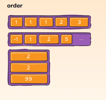
order : 컨테이너 안에서 나열되는 순서
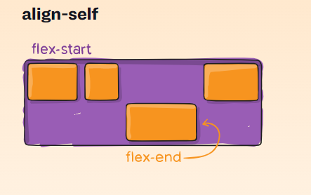
align-self : 보통은 컨테이너가 아이템을 정렬하지만, 아이템 스스로 정렬 방식을 선택할 수도 있음
flex-direction
.container {
	flex-direction: row(default) | row-reverse | column | column-reverse;
}

flex-wrap
기본적으로 flex item들은 일렬로 놓인다.
근데 flex-wrap을 활용하면 줄바꿈을 할 수 있다.
.container {
	flex-wrap: nowrap(default) | wrap | wrap-reverse;
}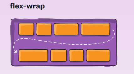
nowrap (default) : 모든 flex item 들이 한 줄에 놓인다.
wrap : flex item들이 여러 줄에 놓인다. top to bot
wrap-reverse : flex item들이 여러 줄에 놓이는데 bot to top
# flex-flow
flex-direction 과 flex-wrap 속성을 한 번에 정의할 때
.container {
	flex-flow: column wrap;
}
justify-content
자식 요소 정렬
.container {
  justify-content: flex-start(default) | flex-end |
        center | space-between | space-around | space-evenly |
        start | end | left | right ... + safe | unsafe;
}
align-items
justify-content의 교차 버전이라고 생각
.container {
  align-items: stretch(default) | flex-start | flex-end | center |
        baseline | first baseline | last baseline |
        start | end | self-start | self-end + ... safe | unsafe;
}
align-content
.container {
  align-content: normal(default) | flex-start | flex-end | center |
        space-between | space-around | space-evenly | stretch |
        start | end | baseline | first baseline | last baseline + ... safe | unsafe;
}
order
.item {
  order: 5; /* default is 0 */
}
flex-grow
.item {
  flex-grow: 4; /* default 0 */
}
flex-shrink
flex-grow 의 반대 느낌
.item {
  flex-shrink: 3; /* default 1 */
}
flex-basis
박스의 크기
.item {
  flex-basis:  | auto; /* default auto */
}
flex
flex-grow, flex-shrink, flex-basis 를 한 번에 쓰기 위한 축약어
이렇게 사용하는 것을 추천하는 바임.
.item {
  flex: none | [ <'flex-grow'> <'flex-shrink'>? || <'flex-basis'> ]
}
align-self
item에 대한 개별 정렬을 지정할 수 있음
float, clear, vertical-align 은 flex-item에 적용되지 않음.
.item {
  align-self: auto | flex-start | flex-end | center | baseline | stretch;
}
※ 출처
jeonghwan-kim.github.io/dev/2020/03/09/flex.html
'HTML & CSS' 카테고리의 다른 글
| css 단위 (0) | 2020.12.13 |
|---|
- Total
- Today
- Yesterday
- HTTP 완벽 가이드
- 김영한 http
- Spring Security
- 백준
- 드림코딩
- 킹수빈닷컴
- js array
- 김영한 JPA
- js promise
- 가상 면접 사례로 배우는 대규모 시스템 설계 기초
- GCP
- 백기선 스터디
- 이펙티브자바 아이템59
- js api
- HTTP 완벽가이드
- ㅇㄷㅇㅈ
- 이펙티브자바 스터디
- 프로그래머스
- 이펙티브자바 아이템60
- REST API
- 모던자바스크립트
- JS 딥다이브
- http
- BOJ
- JPA 연관관계 매핑
- 이펙티브자바
- dreamcoding
- java
- 패스트캠퍼스 컴퓨터공학 완주반
- 프로그래머스 SQL
| 일 | 월 | 화 | 수 | 목 | 금 | 토 |
|---|---|---|---|---|---|---|
| 1 | 2 | 3 | 4 | 5 | 6 | |
| 7 | 8 | 9 | 10 | 11 | 12 | 13 |
| 14 | 15 | 16 | 17 | 18 | 19 | 20 |
| 21 | 22 | 23 | 24 | 25 | 26 | 27 |
| 28 | 29 | 30 |